CSS Grid Layout
Created by Zankevich Anna
CSS Grid layouts are definitely one of the most exciting developments in CSS for years.

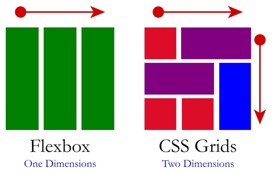
It is a 2-dimensional system, meaning it can handle both columns and rows, unlike flexbox which is largely a 1-dimensional system.
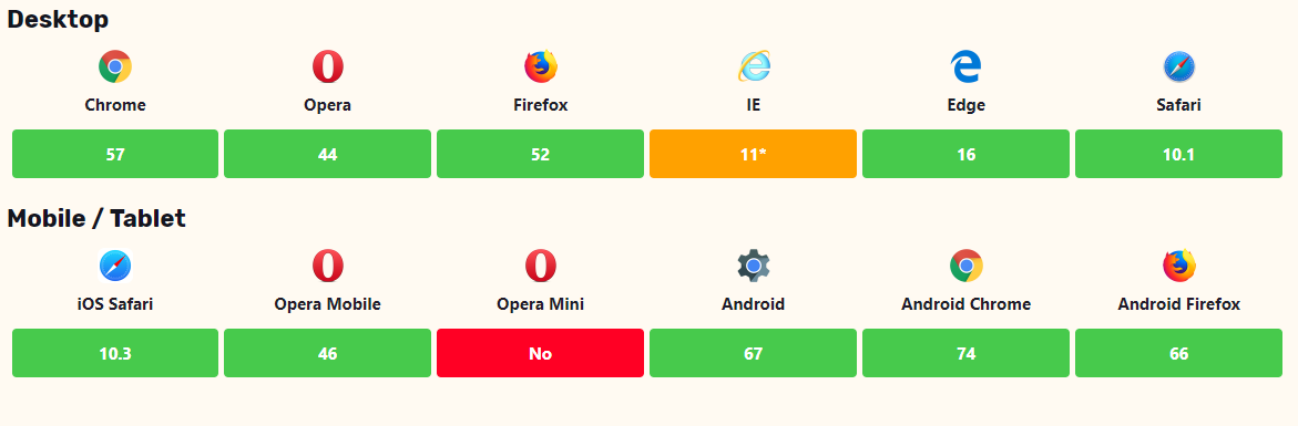
What about browser support?
CSS Terminology
- Grid container
- Grid item
- Grid line
- Grid cell
- Grid track
- Grid area
- Grid gap
Grid Lines
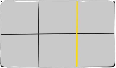
The lines between columns are called column lines.The lines between rows are called row lines.
Grid Cell
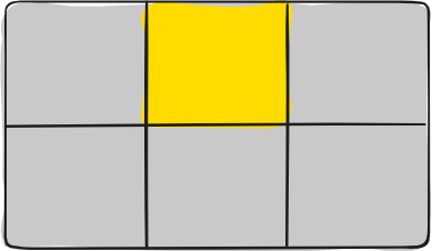
A grid cell is the smallest unit on a grid. Conceptually it is like a table cell.
Grid Area
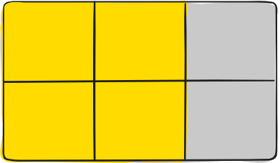
The total space surrounded by four grid lines. A grid area may be comprised of any number of grid cells. Here's the grid area between row grid lines 1 and 3, and column grid lines 1 and 3.
Grid Track
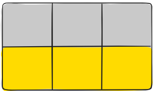
Here's the grid track between the second and third row grid lines.
Grid Gaps
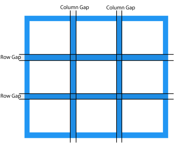
The spaces between each column/row are called gaps.
When should we use grid
- Choose grid layout for larger scale layouts which aren’t linear in their design, but for small-scale layouts use flexbox
- If you only need to define a layout as a row or a column, then you probably need flexbox. If you want to define a grid and fit content into it in two dimensions — you need the grid.
FR
Fr is a fractional unit and 1fr is for 1 part of the available space.
Grid Template Area
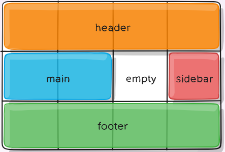
The grid-template-areas property specifies areas within the grid layout. You can name grid items by using the grid-area property, and then reference to the name in the grid-template-areas property.
grid-area-name: [area-name]
______
Specifies what grid area the element is placed within